 | |
| The one that started it all. I've cleaned up the lines, much as I did for Three-Sixty, and I recreated the long-lost italic version of the font. The character set is now more complete, and I think all this has made the world a happier place, don't you? | 
|
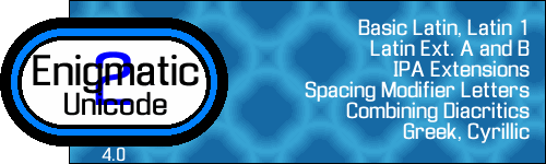 | |
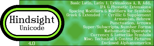
| This font has been updated to Unicode 4.0 and Enigmatic 2, making, um, I dunno, Unatic 6-and-change. | 
|
  | |
|
More puzzle lettering. This time I was doing cryptarithms, those puzzles where an arithmetic problem has
been encoded, letters for numbers, and you have to figure out the solution. This weird art-decoish font came
out, and so I named it after an appropriate author. It didn't occur to me until later that
FITZGERALD had ten different, non-repeating letters, which make it a pretty good cryptarithm
key....
Also comes with a "black" version so you can waste more ink when you print with it. | 
|
 | |
| A fellow puzzler asked me to help him identify a font he'd used in putting together a publication he'd made some years ago before techie typogs were running around digitizing everything in sight. Neither I nor the folks at Typophile could say for sure, but someone thought it could be something called Grock. Gangue is a G-rock: it's the stuff left over after you extract the vein of gold from your ore. GangueOuais isn't this font's original name, but given the, um, naughty nature of the publication in question, I can't tell you what the original name was. | 
|
 | |
| I'm a little embarrassed to admit it, but I liked the title of this song by the Propellerheads so much that I built a font around it. Included in this package are the component bits that go into making each character. | 
|
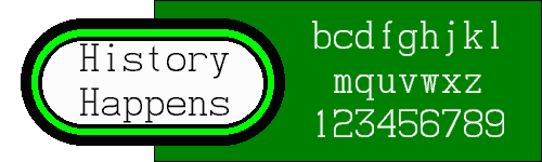  | |
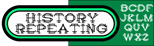
| Every font site needs at least one monospace font, and some version of History Repeating seemed a natural. I made a typewriter font, History Happens out of it. Your computer will recognize it as monospaced, so it can be the "TT" font for your browser, for example. | 
|
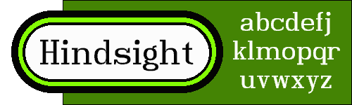  | |
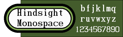
| Hindsight derives from History Happens bold, but I liked the look of it so much, I made it its own font. In hindsight, I should have made this one first. | 
|
 | |
| The missing link in Hindsight's evolution. It's basically the same as History Happens Bold, but now your computer can extrapolate and make it even more bold. | 
|
 | |
| Hindsight looking forward. Keep checking for more added blocks, but be ye warned: some of them are scary-looking and may never get made. | 
|
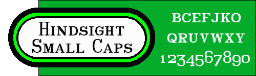 | |
| If you dig into Unicode long enough, you'll get the small caps for most of the Latin letters, so it was really easy to do this font. I added old-fashioned numerals so I wouldn't feel lazy. | 
|
 | |
| A hard-nosed little font that will protect the borders at all costs. This font includes not only the complete Latin alphabet that all my fonts do these days, but also the complete Russian alphabet, so you can warn your sentries behind the Iron Curtain in your 80's spy novel. | 
|
 | |
| Well, it's kinda lemon-shaped. Upper-left and lower-right corners are rounded, and the other two aren't, except in some notable exceptions. | 
|
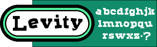 | |
| Your typical heavy, blocky, Texas ghost town font, except that the vowels are all wonky. How do we do it? Helium, and lots of it! Even the accented vowels are askew, and not necessarily at the same angle as the unaccented letter. Note also that most everything is centred vertically, so that dot in the graphic is the normal period. | 
|
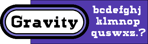 | |
| Your typical heavy, blocky, Texas ghost town font, except that the vowels are not all wonky. Same basic letterforms as Levity, except that the normal x-height is back, descenders descend, and the vowels are at the same old boring angle. Capitals and numbers and all that are identical to the ones in its cousin above, so typing in Gravity and popping the odd letter or word into Levity makes for a whimsical look. | 
|
Graphics (c) 2004, Darren Rigby.
Average Mean people suck.