 | |
| I created an ambigram - a sample of invertible writing - for the NPL's magazine, The Enigma one month, and because that word is so easy to do, I was able to style the letters pretty much as I liked. I liked the look of the result so much, I made it into a font. Every character, except c, k, and v can turn into some other character or itself. To see what the title looked like, type e{g}a . | 
|
 | |
|
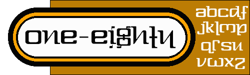
The real reason to have anything to do with this family. If One-Eighty stopped screwing
around being all invertible and got down to the serious business of being a font, it would look like
this.
It's now back and better than ever! What's the use of a font called "Three-Sixty" if you couldn't even type "360�" with it? The original has been cleaned up a ton, the D has two serifs so that it looks like a D, and the N no longer does that weird thing with the line that wasn't there. The world's sassiest font with a numerical name also now comes with an extensive character set. The hyphen's even back in the title where it belongs. | 
|
|
| |
| The same as Three-Sixty, but squished. All the same characters, though. | 
|
  | |
|
Based on a new game by Michael Selinker, which itself was based on a bit of Lovecraftian lore. Demons
live in corners, so he got it in his head to make a word game in which letters score for the number
of corners in the letters. So I made this font with the correct number of corners in each letter (I
think) and named it with a pun on the name of the game.
Some letters have been cleaned up, most notably the more Egyptian lower case a, and a brand spankin' new italic has been created. Special thanks go to Ponofob and the folks at Typophile for their help with getting the Mac version of 1.2 done. The font still has its problems, but it's better than nothing. | 
|
  | |
| The same font as above, except that the dog eats like a bird. Also now with its own italic version. | 
|
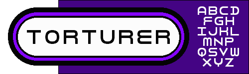 | |
| At the NPL's last convention, I made an evil little puzzle called A Form of Torture. I'll spare you the details, but the idea was that some of the letters turned around so that they became other letters. (cf. One-Eighty) Upper case only. Since any letter can appear in any of four directions, type the lower case version of whatever the things that aren't letters look most like. For example, an upside-down U is "n". | 
|
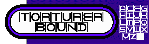 | |
| The letters have been put into squares for crosswords or forms. Black squares are made by typing ".". Empty boxes are spaces. In word processors, you may have to fiddle with kerning and line spacing to get the squares to line up and overlap. | 
|
 | |
| Same as Bound, but Crushed can fit two letters per box. Good for bigram squares or piecemeals. Caps have the boxes, lower case letters don't. TyPeLiKeThIsFoRtHeRiGhTeFfEcT. | 
|
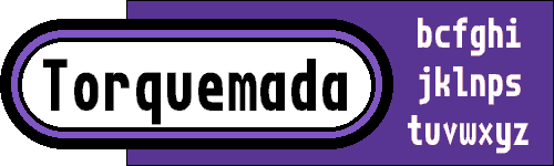 | |
| Since I've been doing so much typing with Torturer Crushed's individual letters all by themselves, I decided to do the honourable thing and make them into a bona fide font of its own. When I make a font family, I mean a font family. | 
|
  | |
| Same idea as Torquemada, but this version's been given only mouldy bread and rancid water. Screw the Geneva Convention! On the other hand it also comes with a bold version somewhere between the two, so I think someone has been hiding chocolate bars or something. | 
|
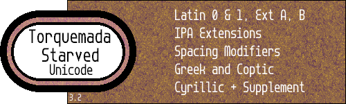 | |
| A baby Unicode font with only the first half-dozen blocks in it or so. None of the combining diacritics are in here because they involve glyphs that have zero advance width, which would make this not a fixed-width font. At least according to all the experimenting I did. | 
|
 | |
|
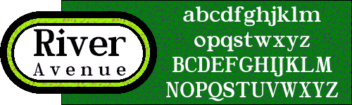
I drew this font on the back of a business card when I needed to write down the directions to
someone's new office. And that office was on - you guessed it - the fourth floor. Includes
alternate characters in Water Street Detour, which tags along.
My friend and neighbour, Eric Urquhart, did the conversions on this and River Avenue, below. These happen to be .sea's rather than .sit's. If anyone really needs the other format (whether compression, or format of fonts), I'll do what I can to provide them. | 
|
 | |
|
I have this compulsion, you see. I just can't leave well enough alone. I make these weird fonts
that have wild personalities and strange rules to them, and then I like their basic concept enough
to tame them down again, like this one. Well, all it means is you keep getting two fonts for the
price of one.
See the note in Water Street about the Mac version of this font. | 
|
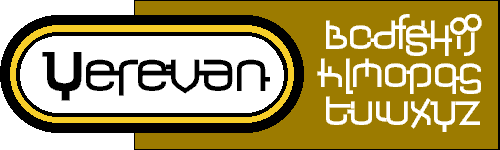 | |
| Having just finished the Armenian block in Hindsight Unicode, I thought of making a regular old Latin font using the same concepts. I started it, hated it, lay down until the feeling went away, and then went back and fixed it. Yerevan is the result. | 
|
Graphics (c) 2002, Darren Rigby.
I haven't been well. And I've been fighting a cold besides.