
|
|
|
|
A hard-nosed little font that will protect the borders at all costs. This font includes not only the
complete Latin alphabet that all my fonts do these days, but also the complete Russian alphabet, so
you can warn your sentries behind the Iron Curtain in your 80's spy novel.
| 
|
|
|
|
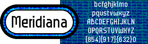
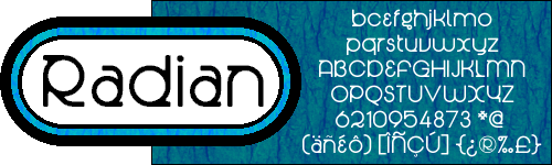
Well, it's kinda lemon-shaped. Upper-left and lower-right corners are rounded, and the other
two aren't, except in some notable exceptions.
| 
|
|
|
|
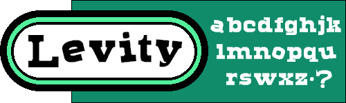
Your typical heavy, blocky, Texas ghost town font, except that the vowels are all wonky. How do we do
it? Helium, and lots of it! Even the accented vowels are askew, and not necessarily at the same angle
as the unaccented letter. Note also that most everything is centred vertically, so that dot in the
graphic is the normal period.
| 
|
|
|
|
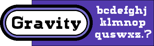
Your typical heavy, blocky, Texas ghost town font, except that the vowels are not all wonky.
Same basic letterforms as Levity, except that the normal x-height is back, descenders descend, and
the vowels are at the same old boring angle. Capitals and numbers and all that are identical to
the ones in its cousin above, so typing in Gravity and popping the odd letter or word into Levity
makes for a whimsical look.
| 
|
|
|
|
I've discovered a new way to draw circles so that I can easily make semicircles and quarter-circles.
To test it out I made this font, named after the great circles we've imagined on the Earth.
I even know how to draw a perfect circle with an Etch-a-Sketch. Just move each knob in a perfect sine
wave. (I said I knew how; I never said it wouldn't be a pain in the butt.)
| 
|
|
|
|
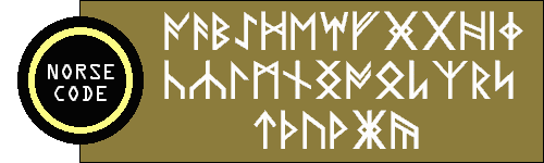
Created when the National Puzzler's League's editor complained that he couldn't find a rune font
that matched our standard dictionary's version. Sure, it came a little late (The editorship had
changed before I made Norse Code), but these things take time. Write a letter home to Mother in this.
You know you want to.
| 
|
|
|
|
A Bauhausey kind of font that's really just a modified version of Meridiana. You can see a
resemblance, I'm sure, but this font is actually monospaced. Why OneSlot? Because I looked up "simple"
in my English-German dictionary (German, because this is a Bauhausey kind of font) and the translation
seems to be "einfach". "Ein" is one, so I looked up "Fach" and it means, among other things, a
pigeonhole. OnePigeonhole is kinda long, so I changed it a bit. Just like I did to Meridiana.
| 
|
|
|
|
Lots to explain here. First, this is the non-monospaced version of OneSlot above. Second, in keeping
with the German theme, "Anderthalb" is a German word, and is pronounced approximately like
"AHN-dairt-hahlp". That's "th" as in "hothead", not as in "thud". Third, anderthalb means, get
this, one and a half. It's fitting because this font is mono-and-a-half-space. The size of a block
has been reduced to half of what it was in OneSlot, and then letters were allowed to take up one, two
or three blocks, instead of forcing them all to be the same size. Just like those paper towels.
| 
|
|
|
|
I saw a magazine article about a designer who made a font that had many joined pairs of letters, and
wondered how he made it work. This probably isn't how, but enjoy the result of the experiment.
| 
|
|
|
|
More adventures in roundness. Judging from my site, you'd never guess that I have a small thing for
circles. This is definitely more of a titling font.
| 
|
|
|
|
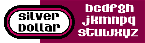
Hee-hee. Shi-i-i-iny. The x-height for the lower case letters is the same as the height of most of
the capitals.
| 
|
|
|
|
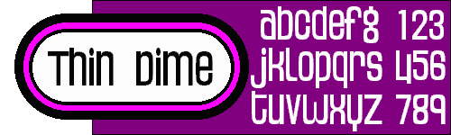
Silver Dollar on a diet. If you follow only the inside curves of Silver Dollar and trim away the rest,
this is what you get.
| 
|
|